
We all do it, don’t we? In the visual world we live in where we watch screens for way too many hours a day, we are programmed to respond to visuals which catch our eye. It’s the same with a book cover – it needs to catch your eye in the bookshop, online or in the supermarket. You need to have that first reaction to the cover to then pick up a book and read what it’s about and whether you want to read it or not.
As a reader, author and bookseller I see book covers every day. The surround me at work and home and when shopping because I almost always go into a book shop. So, I’ve seen many different types of covers and can usually tell instantly what genre the book is inside. This is what you want. You want a reader to know what type of book this is but you also want to intrigue them to want to read inside. If they think they already know exactly what to expect from a book, they probably won’t bother parting with their money.
It’s a tricky thing to get right then. A cover needs to stand out but also fit with other covers in the genre, and it needs to let you know what to expect from the book but pull you in to reading it. I’m actually glad I’m not a cover designer!
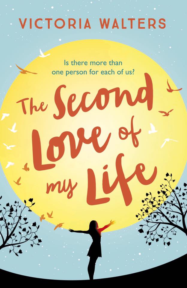
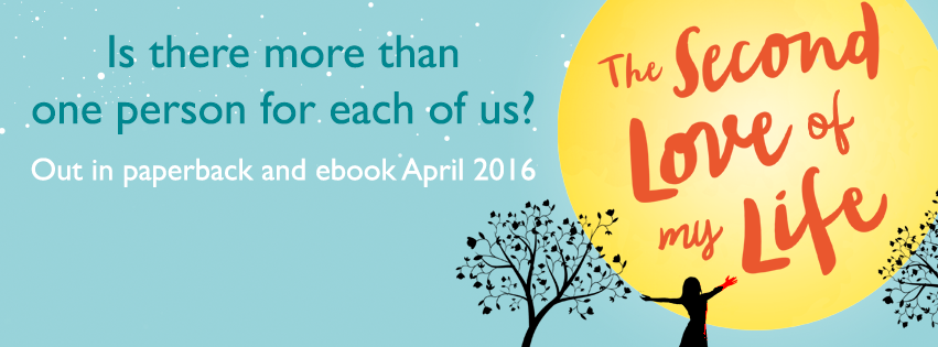
I am really happy with the cover of my novel because I think it does all of this! And I can say that as I didn’t design it 🙂 What I was intrigued about was how the cover for the short story prequel to the novel would look like. Would it be similar to the novel? Would people realise it was written by the same author and the books were linked? But would it also be clear you could read the short story as a standalone piece as well?
Again I’m so happy with what my publisher has created because thankfully I think my short story cover hits all of these things.
Ta-da! ….

For me, it complements the novel cover perfectly. The design is similar so you know the stories are linked but it works for a romance story in its own right. I love the pink so much! Plus you may have spotted the butterflies, which made me so happy because as you know I love them and have a tattoo of a butterfly. I think it’s super pretty and would stand out to me when book shopping (the book is also a bargain at 99p, just sayin’ – pre order here: http://amzn.to/1VGdI50) so I really hope it will do to readers out there.
What’s most exciting to me is seeing the covers together and realising this is the start of my author brand! Look at my little name on TWO covers. I may have to go and have a lie down 🙂
What kind of covers stand out to you the most?
Victoria
xoxo

Both covers are super catchy, congrats! 🙂
Thanks lovely!
Love your covers Victoria! I like when I can tell exactly what I’m getting from the cover. It should intrigue but also convey. 🙂
Thanks Kourtney! Yep I think that’s it exactly 🙂
Beautiful titles and covers for the books. Congrats on this occasion.